Tuesday 31 May 2011

KISSY KISSY FAIRY

As you may have recently seen over on Jono's blog, we've been revisiting January's doodle week. Click here to read about his Fishbowl.
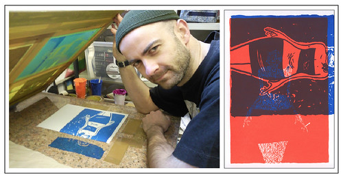
Both Jono and I have been working on and off on these between other things and to be honest, returning to them now demonstrates perfectly the need for us to up our print frequency.

Kissy Kissy Fairy

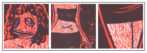
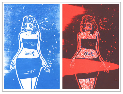
Last night two of my doodles made their transition into print. It's interesting how, as you pull a print, you can be faced with something very different from the picture that you formed in your head some month before. Part of the problem in leaving too much time between concept and execution is that ideas are forgotten and the rational behind certain inking experiments grow hazy. Even something as fundamental as colour choice can be misremembered.
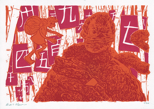
Printing Kissy Kissy Fairy (pictured above) was straight forward. A perfect run of 20 with no errors but the influence of the white bamboo is a curiosity. As I've inferred before, when it came time to ink the work I'd to a certain extent forgotten the divison of colours and had the whole while envisaged a print where only the Chinese numbers were white. And I think perhaps the original intention would've seen the purple of the character line art block out the non-orange areas leaving only the white sheets strung to the background stocks. But as I say, the white does seem to contribute nicely to the print and complements the two other colours rather well. The scene appears gentler, perhaps more delicate and inviting.

DUCK-FACED WOMAN

Midnight details

The other print, Duck-Faced Woman, as I've been calling her for the past few months, spat out a few more hiccups. I'm not entirely sure I got the colour scheme right, or the order in which they were printed for that matter. A darker orange going on first, followed by an even darker blue may have been the way to go.
Also, because of the large area of ink/small suction surface area (for the vacuum table) the prints would continuously stick to the screen forcing me to pull again in an attempt to achieve adequate spring back, separating the screen from the ink wet paper. In doing this my rhythm went a bit of and I pulled a print with out first flooding. The resulting print (seen below left) has a certain weathered charm which I'll be keeping in mind for some intentional misprint fun on future works.

Midnight errors

Later in the run I absentmindedly placed my paper landscape when it should've been portrait. Immediately something looked wrong with the pull but assuming wrongly it was ink stickiness I tried a few spring back pulls. It wasn't until Jono pulled me off the print and lifted the screen that I realise my mistake. Still, I went ahead and printed the second colour over this as normal which gave an interesting insight into how the weight of colour and texture could alternatively have been split. An insight I hope to channel soon.

Midnight misprint

WELCOME TO last night

We are and will increasingly become the product of last night.

Jono Sandilands and I, Andrew Morrison are lifting the roller door on the print garage and exposing our world of art errors, experimentations and eureka moments. With heightened enthusiasm we've come to realise the obvious developmental potential of weekly printing. We've already established substantial momentum and are seeing a rapidly growing body of work. Lessons learned and happy accidents are quickly exploited and all we've become will be offered up to another last night.