Wednesday 27 July 2011

POOP DECK PRINTS part 2

Poop Deck Prints

As you may have read last week Andrew Morrison and myself were busy preparing a new body of work to go on show/sale in the Peerie Shop Cafe, Lerwick. After a busy weekend of printing we produced a set of limited edition screenprints to coincide with The Tall Ships Races, Lerwick 2011. This is the first exhibition we've put together as Last Night, our Co:Lab side project.

Jono Sandilands & Andrew Morrison

The Tall Ships have now been and gone, and with them brought lots of celebration, events and most of all visitors, the town was buzzing with people and activity over the festival and with so much on, a much needed pit stop in The Peerie Shop Cafe for a cup of coffee and fresh local food alongside our new screenprints was a must... if you could get in the door...

If you missed them over the festival, we're happy to let you know they are still on show until Monday 1 August.

Jono's technique and process
With the agreement of a loose theme for the exhibition, I wanted to explore some more techniques using the same method I've used for the past few screenprints, using cut paper as original artwork for the stencil.

What I'm trying to achieve is to get some interesting effects with the loose brushed texture and the fine delicate cuts of the paper and do this over multiple layers of print. To get into the project I start with the textures, this is very enjoyable and messy, producing around 10 sheets of textured paper with different styles, thick brushed paint, watered down paint, dripped on paint and mono printed from glass solids.

These are then left to dry and I can begin on the next step of rough penciling onto the back, but sometimes front of the painted paper. At this point I will have done a loose sketch and have an idea about colours and how I'd like the final print to look (Note: what you see here isn't what I originally intended). I get the blade and cutting mat out and begin cutting the artwork into the textured paper.

My mind instantly switches on to cut mode and I start to imagine the rough outlines I've penciled, cut out. This is when I have to think on my feet and be a couple of steps ahead of myself, otherwise I'll make a wrong cut and part of the image will fall out. Things change, sometimes dramatically, I start to become more freestyle with the knife. Cutting, although fun, is very time consuming and the more intricate, the more hypnotic.

These cut layers are scanned and output to film for exposing to the screen. The next experiment I want to do is to paint and cut directly to film to miss out the printing to film step, which we always have found to be where problems arise. (ie forgetting to order more acetate with a deadline, size of acetate, printers melting film AAARGH!) We always found a way around but I want to miss that step out.

As I mentioned I had a good idea in my head how I wanted the prints to look like. Another part of the process I need to learn to accept is seeing the final results are completely different from the initial idea.

Monday 18 July 2011

POOP DECK PRINTS

Poop Deck Prints

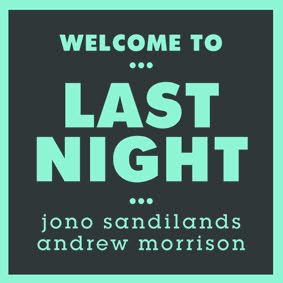
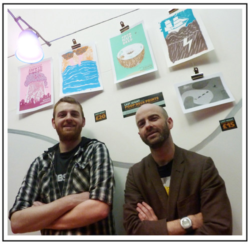
Last night Jono and I wrapped up an intensive weekend of drawing and printing with the hanging of new work at the Peerie Shop Cafe. This is the first exhibition we've put together as Last Night, our Co:Lab side project.

Jono Sandilands & Andrew Morrison

We have, together with Beto, exhibited at the cafe before with our Heart Your Head charity prints and very much enjoyed the space and the exposure it afforded us and with this in mind we decided to meet with Emma Gibson, the owner of The Peerie Shop Cafe to explore ideas for future events.

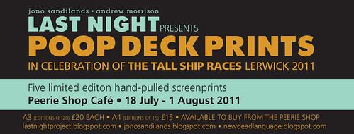
July is set to be a big month in Shetland with the Tall Ships Race - Lerwick 2011 already creating a buzz around the town. We have of course known this was coming for some time and had discussed amongst ourselves the possibility of furnishing the periphery of the event with some print work. It wasn't until our meeting with Emma however that we decided to commit ourselves to a new collection we're, in post production, calling Poop Deck Prints.

We had two weeks in which to squeeze out our ideas and work them up into serviceable prints.

By the Thursday of the first I'd barely achieved a couple of roughs I was happy with (by way of a few ideas set aside for another time) and spent the next four days with them shelved as I enjoyed a weekend in and around Newcastle!

By the Wednesday of the second week I was having to wrangle more and more hours from the day. Wednesday's pencil work saw a 1am finish which was surpassed on the Thursday as I completed the first layer of inking at 1.30am. Friday night saw 2.30am of Saturday morning and an end to the inking of print number one – The Objectionable Awktopoose.

Awktopoose development work

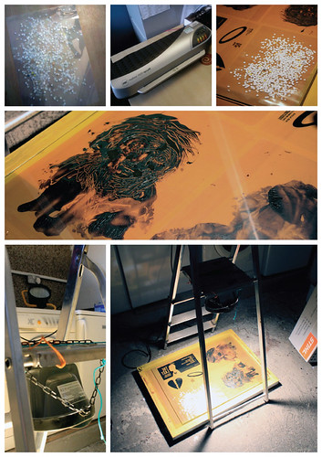
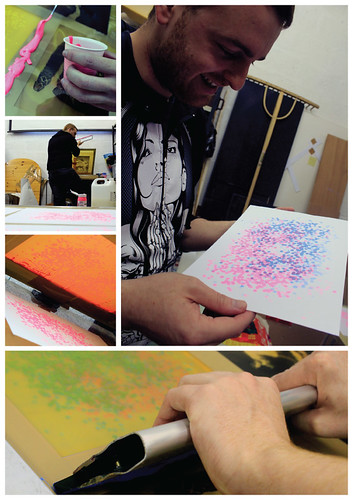
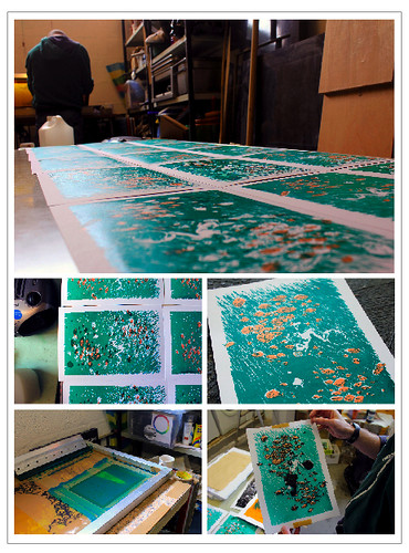
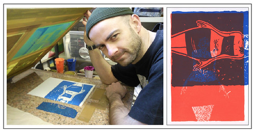
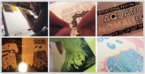
Above (clockwise from top left): Standing inking at the drawing board ... probably bad for my posture; I use half a cocktail stick to push down the paper to see clearer the lines below as I ink; half inked letter work ... I like these ragged edges; The perfect but on this occasion unusable blue for the pink; sanding down the acetate; the doomed exposure.

Saturday proper had us ready to roll by 10am and despite a slow start – sorting out acetates and such – things seemed to be going well. I mixed the perfect pink for Awktopoose and pulled 20 perfect prints. This however was all for nothing as when I attempted to register the second colour I discovered, bizarrely, I just couldn't get them to match up at all and a realisation washed over me. I'd somehow printed the acetate at different sizes. Not by much, a few percent here or there, but enough. One out of three appeared to be correct but the other two were rubbish and – aargh – I had to blast out the screen onto which I'd exposed them.

What made this all the more problematic was the fact that we now only had three A3 acetates left and they were supposed to be lying in reserve for my second print of the series. We'd noted however on a previous occasion that a used acetate can, with a bit of effort, be rubbed clear. And so, with sanding block in hand I attempted to reclaim the flawed sheets.

No joy though. Despite relative success in scrapping the sheets clean, for reasons I've yet to fathom, the acetate just wouldn't go through the copier a second time and I was left with no choice but to use the three remaining A3 sheets. This was a frustrating set back with repercussions yet to be dealt with but at least with fresh acetates we were back on track.


Awktopoose print

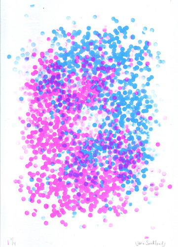
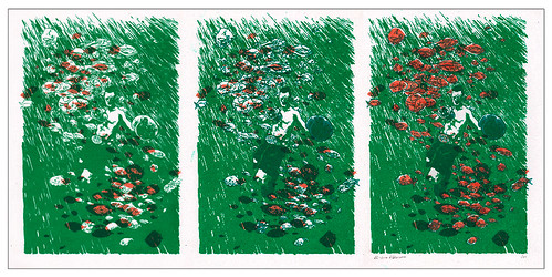
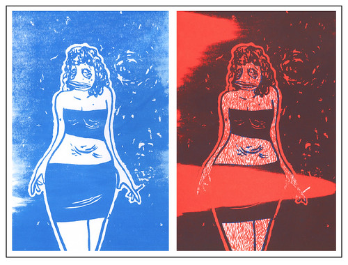
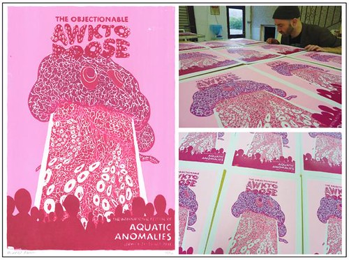
The Objectionable Awktopoose - edition of 20 hand-pulled and signed by the artist.

I had a very clear picture in my mind of the colours I wanted to see these prints in and continued to mix them with relative ease. The opacity of the white we use was proving to be a problem however. In achieving the pastelesque colour shades I desired I was having to mix a fair bit of white in with the chosen pinks and blues and such. This sadly meant that the areas of the first, pink layer I was wanting to blend with the second colour was simple failing to shine through the dense white mix. Had I thought, I could have planned around this but I have an enthusiasm for cheating extra colours from a print through overlapping and was on this occasion scuppered by it. I still think the blue and the pink I selected are very successful together but, to get the most from this print I had to substitute the blue with magenta followed by a rich purple. As both these colours have a degree of transparency the pink shone through successfully albeit with a result I hadn't expected. The magenta blend create by the two colours was actually lighter that the regular magenta and the areas I'd design for shadow actually seems to glow. I'm not entirely displeased by this. As the subject is a peculiar octopus type thing it doesn't seem unreasonable that it might glow.

We packed up printing for the day at about 6pm but this by no means allowed time to relax as I still had all three layers for the second piece to ink before returning to the print table on Sunday morning. While I work I listened to a curious album my brother had linked me to. 13 Chambers by Wugazi. Basically an entire album of Wu Tang Clan/Fugazi mash ups. I don't really know the Wu Tang all that well but it worked remarkably well with the music of Fugazi and it was fun to here familiar tunes in an unusual context. Anyway in so far as the inking – I had two finished by 3.30am, went to bed and, on waking, had the final layer finished by 10.30am.

As I'd squandered the last of the A3 acetates the previous day I was left to print each colour layer on to two A4 sheets and tape them together. This actually worked quite well but I wouldn't recommend it for anything of a larger scale.

Coconut Deep print

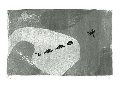
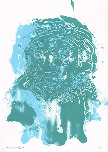
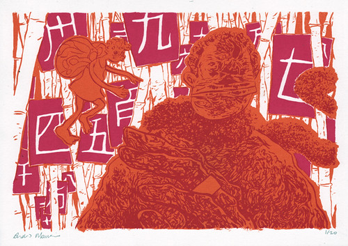
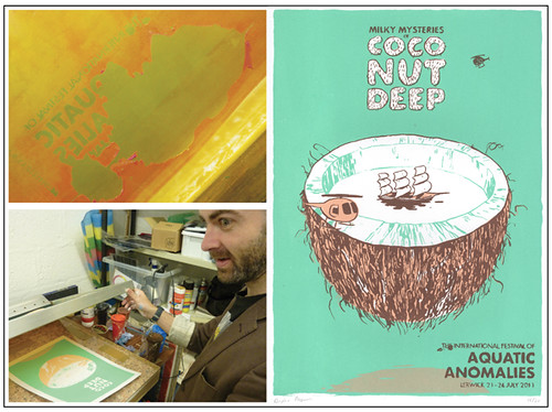
Milky Mysteries of Coconut Deep - edition of 20 hand-pulled and signed by the artist.

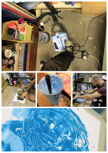
We'd by this time had to mix up a fresh batch of emulsion for coating the screens. It was perhaps because of this, and us probably not allowing enough time for the mix to settle or whatever, that our first exposure of the day failed and, as you can see in the photo, began to blast out in areas it wasn't meant to. This again is a frustration when working so close to a deadline. We're well used to such hiccups however and coated a fresh screen, following up with a successful exposure and wash out.

From here my second piece, Coconut Deep went entirely to plan and is almost exactly as I pictured in my head, which is unusual!

Hopefully some of you will get the chance to get down to the Peerie Shop Cafe to see and perhaps make a purchase of our latest efforts (and enjoy some tea and cake of course)! The A3 prints are selling for £20 and Jono also has one A4 print available for £15.

Over the weekend we've been discussing a new project with a deadline in October. For now though ... I relax!

Watch for Jono's blog on his Poop Deck Prints to follow.

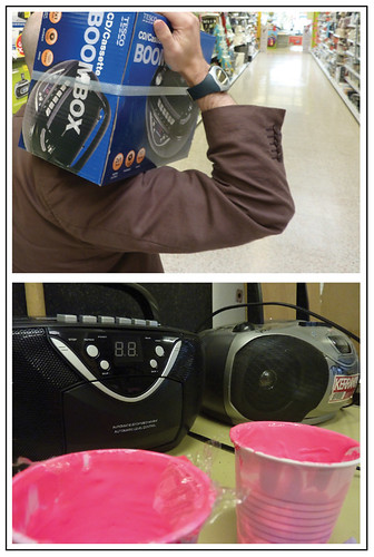
... nearly forgot ... we got a new boombox for the print garage!

New print boombox

Tuesday 28 June 2011

SPEED PRINT


Last night we got our hands dirty in some rapid print exploration. After a quick lunch meeting to discuss future exhibiting, we made the ambitious deal to each produce a piece of experimental artwork, to utilize otherwise unused space on a screen, whilst exposing artwork for another project Jono is currently working on.

Speed Printing

With the tight time restraint of an afternoon to produce artwork, and both of us with busy day jobs, this proved to be slightly difficult, but with interesting results...

Speed Printing
For Jono: With five minutes to spare until print time, he used what came to hand in the office. The disused, punched out holes from a random hole punch were placed inside a laminating pouch and haphazardly fed through the laminating machine to create a positive for exposing to screen. We're always on the lookout for alternative ways to expose to the screen, and laminating just became another option to explore further.

Speed Printing
For Andrew: With time of the essence, he used the time Jono needed to setup the printing equipment to create his artwork. Two layers speed painted straight onto acetate and hairdryered minutes prior to exposing the screen. This method is something Andrew has been intending to experiment with for some time, and this was the perfect opportunity to try it out. More of this to come. See below for final results (left: Andrew's Experimental Face & right: Jono's Holy Sheet)

Experimental face (speed printing)Holy Sheet (speed printing)

Sunday 26 June 2011

BOXERFISH

boxerfish

For many known and unknown reasons this print has been a long time coming. The original layers were inked and uploaded to my flickr page 18 months ago. Unsurprisingly when I came to print I couldn't remember the exact colours I'd intended to use although perhaps surprisingly I got two out of three right. I'm still not entirely sure what the third colour would have been had I printed at the time of illustrating (I have a note of it somewhere) but the results are satisfying enough.

boxerfish progress montage

You can see above a few of the photos Jono took during the printing. Including middle left a peak at an exploited misprint (more of later...) and the corner of our trusty boom box which, as the only cassettes we have are a good 15 years old, is more often that not blasting out They Might Be Giants second album, Lincoln. Other favourites include Ween's live album Painting the Town Brown and early Modest Mouse eps and 7"s that I recorded onto tape alongside an occasional New Bad Things or Yummy Fur 7" (a much missed Glasgow band). You can also see in the bottom right photo the acetate for the final layer positioned over the print in progress for purpose of registration. At this point there's always a fleeting temptation to print the layer in black as it always looks so striking!

In the image below you can see the developmental stages of the aforementioned misprint. Absentmindedly I'd printed the green layer the wrong way over the copper layer. This gave a curious impression of depths and shadow, the suggestion of a denser school of fish than I'd originally drawn. It's a very nice effect that I wish I'd had the foresight to do intentionally. Intrigued, I split the run in two with half following the error and half continuing down the intended path.

boxerfish shadow stages

There are 10 copies of each variation, A4, signed and numbered. The main version is available over on etsy but if you fancy buying a copy of the variation just let me know and we'll sort that for you.

Now check out the video...!

Printing June 25 from Jono Sandilands on Vimeo.

Tuesday 31 May 2011

KISSY KISSY FAIRY

As you may have recently seen over on Jono's blog, we've been revisiting January's doodle week. Click here to read about his Fishbowl.
Both Jono and I have been working on and off on these between other things and to be honest, returning to them now demonstrates perfectly the need for us to up our print frequency.

Kissy Kissy Fairy

Last night two of my doodles made their transition into print. It's interesting how, as you pull a print, you can be faced with something very different from the picture that you formed in your head some month before. Part of the problem in leaving too much time between concept and execution is that ideas are forgotten and the rational behind certain inking experiments grow hazy. Even something as fundamental as colour choice can be misremembered.
Printing Kissy Kissy Fairy (pictured above) was straight forward. A perfect run of 20 with no errors but the influence of the white bamboo is a curiosity. As I've inferred before, when it came time to ink the work I'd to a certain extent forgotten the divison of colours and had the whole while envisaged a print where only the Chinese numbers were white. And I think perhaps the original intention would've seen the purple of the character line art block out the non-orange areas leaving only the white sheets strung to the background stocks. But as I say, the white does seem to contribute nicely to the print and complements the two other colours rather well. The scene appears gentler, perhaps more delicate and inviting.

DUCK-FACED WOMAN

Midnight details

The other print, Duck-Faced Woman, as I've been calling her for the past few months, spat out a few more hiccups. I'm not entirely sure I got the colour scheme right, or the order in which they were printed for that matter. A darker orange going on first, followed by an even darker blue may have been the way to go.
Also, because of the large area of ink/small suction surface area (for the vacuum table) the prints would continuously stick to the screen forcing me to pull again in an attempt to achieve adequate spring back, separating the screen from the ink wet paper. In doing this my rhythm went a bit of and I pulled a print with out first flooding. The resulting print (seen below left) has a certain weathered charm which I'll be keeping in mind for some intentional misprint fun on future works.

Midnight errors

Later in the run I absentmindedly placed my paper landscape when it should've been portrait. Immediately something looked wrong with the pull but assuming wrongly it was ink stickiness I tried a few spring back pulls. It wasn't until Jono pulled me off the print and lifted the screen that I realise my mistake. Still, I went ahead and printed the second colour over this as normal which gave an interesting insight into how the weight of colour and texture could alternatively have been split. An insight I hope to channel soon.

Midnight misprint

WELCOME TO last night

We are and will increasingly become the product of last night.

Jono Sandilands and I, Andrew Morrison are lifting the roller door on the print garage and exposing our world of art errors, experimentations and eureka moments. With heightened enthusiasm we've come to realise the obvious developmental potential of weekly printing. We've already established substantial momentum and are seeing a rapidly growing body of work. Lessons learned and happy accidents are quickly exploited and all we've become will be offered up to another last night.